The Microsoft stores feature a one-of-a-kind panoramic video display that wraps around the entire inside of the store. As more and more stores have been rapidly opening across the United States and internationally, I was asked to design a web app that would automate video playlist management. The first of many unique problems to tackle for this project was that there are multiple videos playing on the video wall simultaneously at all times in various wayfinding product zones (represented below in the animated diagram). On top of that, the videos cycle off and in their place multi-frame image sequences called "zone tiles" (also noted below) pop up. A multi-tiered file and playlist management system was in order... no small task.
MICROSOFT STORE MEDIA PLAYLIST MANAGER
UI/UX design for a one-of-a-kind media playlist manager for Microsoft Stores worldwide.
Tags:
playlist, management, video, digital signage
Fields:
UI/UX

The first task at hand was to devise a way to easily create and manage playlists that are set by a start date and contain multiple child playlists. The parent/child file structure was best visualized by a columns file browser UI. With this design, a user can view the entire set of playlists by date, view the zoned playlists contained within a certain date, as well as a quick preview of the videos and tile layout that will be viewed on a specific zone.

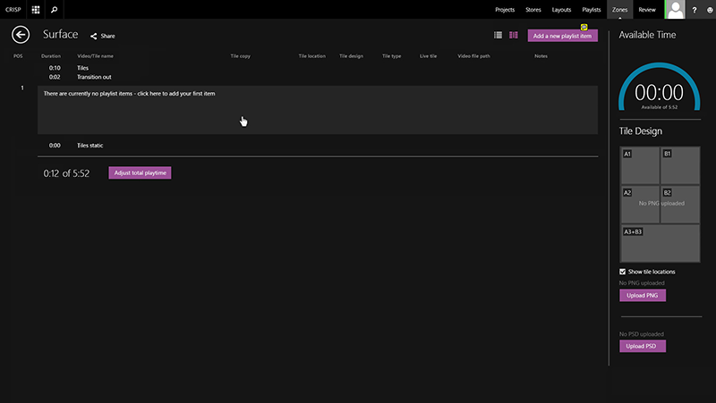
Drilling down into a newly created playlist brings the user to a new interface where no playlist items have been added yet. A speedometer style widget seen on the right-hand sidebar helps the user work out the precise timing of the videos and zone tile playtime.

An in-line drop down menu with fun and interesting form fields appears to allow the user to fill out the needed info for their first video in the playlist. Thankfully, I added a "duplicate playlist item" function to cut down on typing as much as possible.

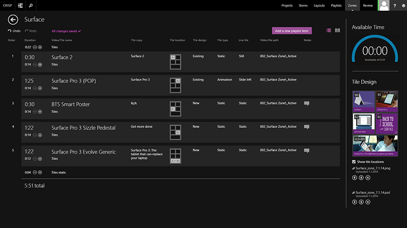
An example of a fully-fleshed out playlist!

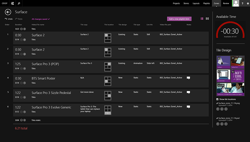
Whoops! The user as exceeded the run time limit for this playlist. Luckily the speedometer widget can help get them back on track by telling them how many seconds they need to shave off in order to hit the target run time.

Need to reorder your playlist? Just drag and drop!


I included a handy split screen view to allow the user to compare their current playlist to a playlist used at a past date.

Upon launch, this app immediately proved to become an essential part of the daily work flow of video wall management, saving countless hours of manual labor and human error and increasing efficiency for the ever growing global network of connected Microsoft Stores.

Tags:
playlist, management, video, digital signage
Fields:
UI/UX