The rapidly growing number of Microsoft Stores with a wide variety of shapes and sizes was quickly proving to be a time consuming challenge for the design team responsible for creating seamless environmental digital signage experiences.
DIGITAL SIGNAGE RESPONSIVE DESIGN UX
UI/UX design for a unique desktop application designed and developed for the design teams that create video content for the Microsoft retail stores.
Tags:
digital signage, Responsive Design
Fields:
UI/UX

I worked in conjunction with the digital signage design team to create an effective workflow and desktop application to efficiently
configure designs optimized for the varying shapes and sizes of store dimensions.
Here's basically how it works...
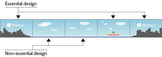
The design of a video campaign for the Microsoft Store digital canvas must consist of areas of essential design, such as areas that feature key messaging, hero product images, and other focal points, as well as areas that could be considered non-essential design.
The (low-res example) panoramic design seen below would be created to be displayed in the largest stores. The goal is to simply reconfigure this design to display seamlessly in smaller stores.


The primary function that the application provides the user is the ability to split up the design into slices...

... extract non-essential design elements...

... and push the essential design slices together in order to create a successful design for a smaller store.

Got it? Good.
Let's take a look at the UI design!
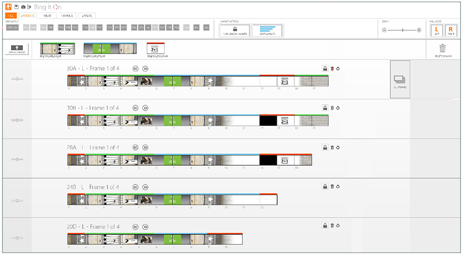
Below is a sample screen of the application. Each row represents a different store layout.

The user starts the process by loading their full sized design to the application...

... and then adds the smaller layouts one by one, taking out non-essential slices where needed.

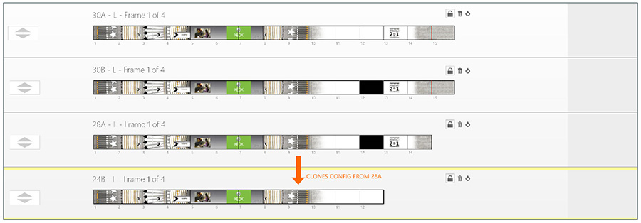
Any new layout added automatically inherits the configuration properties of the parent layout directly above it to reduce the amount of repeat work to nearly zero creating an efficent workflow.


This application has proven to be essential to streamlining the design workflow for digital signage for the Microsoft Stores.
Adding personality
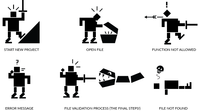
The user is essentially creating a "legend" for the video display configurations, so in order to give the application a bit of polish, personality, and humor, I introduced the "Hero of Legend" into the experience. This stalwart hero adds a bit of gamification to the legend solving process and encourages the user to solve layouts with gamer-like speed and reflexes. He also made appearances in dialogue boxes in a very non-annoying, non-clippy-like fashion.


Tags:
digital signage, Responsive Design
Fields:
UI/UX